If you’re working on a pitch deck presentation, it helps to know what actually gets people to pay attention. The goal isn’t to impress with volume but to communicate your idea clearly and confidently.
These six practical tips will help you structure your deck so it’s easy to follow and makes a strong first impression.
1. Show Traction Early
Start your pitch deck presentation with real signs that people are interested in what you’re building. This could be paying users, email sign-ups, pilot customers, or companies testing your product. Even small signs of traction can make a strong first impression, especially when they show progress.
It’s better to highlight growth over time rather than just totals. For example, saying your user base grew from 200 to 1,000 in two months tells a clearer story than simply stating that you have 1,000 users. This shows momentum, not just activity.
Here are some common ways to show traction:
- Revenue from early pilot customers
- Sign-ups collected from a landing page
- Active beta testers with useful feedback
- Conversion rates from a small campaign
- Retention rates after 30 or 60 days
If you haven’t launched yet, focus on early interest and validation. For instance, if 500 people joined your waitlist within a week, that’s worth including. If you surveyed potential users and changed your product based on their feedback, briefly share what you learned.
Tools like Carrd or MailerLite can help you build landing pages and track sign-ups, while Typeform or Google Forms are useful for gathering user input. Traction is easier to understand when it’s visual.
A simple chart that shows user growth, revenue trends, or waitlist sign-ups makes your progress clear. You can track and organize your data in Google Sheets, then use a tool like Canva, Figma, or the presentation software to turn that data into clean, investor-ready visuals.
The goal is to show that you’re not just working on an idea but building something people are already responding to.
2. Make Every Slide Skimmable
Every slide in your pitch deck should be easy to understand in just a few seconds. People often scan rather than read, especially during short presentations or first meetings. If your slides require too much effort to interpret, your message may be lost before it’s even heard.
Start with a short, clear headline that communicates the main idea of the slide. Instead of vague titles like “Solution” or “Overview,” use something specific and informative, such as “User retention improved 35% in Q2” or “$1.2B market with 12% annual growth.” These kinds of headlines allow your audience to immediately grasp what matters.
Keep the content focused on one idea per slide. Avoid mixing unrelated points like pricing, growth, and customer feedback all in one place. If you have more to say, break it into multiple slides with clean layouts and minimal text.
Slides are not there to hold everything you want to say — they should support your talking points and make key information stand out.
Use short phrases or brief sentences to highlight supporting information, and include one strong number or visual that reinforces the headline.
For example, “Sign-ups increased from 300 to 850 in 30 days” tells a clear story in a single line. If you’re showing a trend, a simple graph does more than a paragraph ever could, as long as it’s uncluttered and easy to read.
A good rule of thumb is to spend about one to two minutes per slide. This helps you plan how many slides you need, depending on how much time you have to present. For a ten-minute presentation, around 7 to 10 slides usually work well, as it gives enough space to explain your key points without rushing or overloading the audience.
3. Make Slides Visually Clear
In a successful pitch deck presentation, design choices affect how quickly and clearly your message is understood. When slides are laid out thoughtfully, your audience can absorb information without distraction or confusion.
This does not mean using flashy graphics or effects. It means making each slide visually clean, consistent, and focused on one idea at a time.
Here are practical ways to design slides that support your message:
- Use consistent formatting: Apply the same font styles, sizes, and colors across all slides. Place headlines and content in consistent positions. This helps people scan and read more comfortably.
- Leave space between elements: Avoid filling every part of the slide. Use white space to separate key points so nothing feels crowded.
- Present one idea per slide: If you are explaining multiple concepts, break them into separate slides. This improves clarity and avoids cognitive overload.
- Use visuals that explain: Include graphs, icons, screenshots, or simple diagrams that support the content. For example, a clean bar chart showing monthly growth or a screenshot of your product in use is more useful than a decorative image.
- Keep colors simple and readable: Choose two or three main colors, and make sure there is enough contrast between text and background. Your slides should be easy to read on any screen.
- Minimize the use of animation: Transitions or motion effects should be used rarely and only when they help explain something. Avoid anything that distracts from the core message.
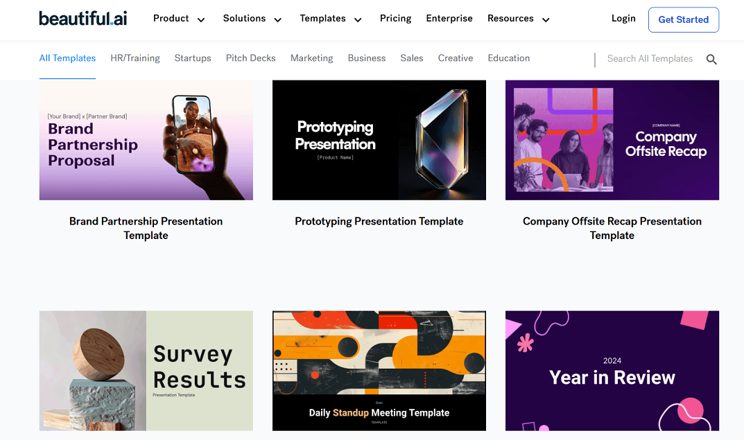
If you want to speed up the design process, you can explore AI tools that help you create slide layouts, generate visuals, or even build complete presentations. Platforms like Gamma and Beautiful.ai offer templates and design suggestions that can save time and reduce the need for manual formatting. You can find a broader list of useful platforms on Siteefy.
However, if you would rather leave the visual work to professionals, you can also turn to pitch deck design services. A dedicated design team can take your content and apply the same rules to create a polished, investor-ready presentation.
4. Explain How You Make Money
Another important rule is to explain how the business makes money. This helps your audience understand the model behind your product and the path toward sustainable growth.
Be clear about what you offer, who pays for it, and how often. Keep the explanation simple and specific so it’s easy to follow.
Here are key points to include:
- What your customer is paying for, such as a product, service, or subscription
- Who your typical customer is and how they access or purchase the offering
- How payments work, whether one-time, monthly, or through another structure
- What your profit margins look like, or how you expect them to improve over time
If possible, walk through a simple example using real numbers. For instance, one customer pays fifty dollars per month, stays for twelve months, and costs ten dollars per month to serve. This gives a quick view of revenue and profitability without going deep into financials.
If your business has more than one source of revenue, explain them separately so each part is easy to understand.
If you are not generating revenue yet, describe how you plan to start. Share your pricing approach and any early feedback that supports it. Instead of including extra visuals, focus on making the explanation clear in words.
This part of your deck shows that your idea can become a functioning business, not just a product with potential.
5. Highlight Why Your Team is the One
Investors do not only invest in ideas. They also invest in the people behind them. A strong team slide gives confidence that you have the skills, experience, and mindset to execute what you are presenting.
This section should show why you and your team are uniquely suited to solve the problem and grow the business. Focus on relevant background, past results, or hard-to-replicate knowledge.
You can include:
- Experience in the same industry or problem space
- Previous startup or business success
- Specific technical or product skills that are critical to your solution
- Advisors or collaborators who bring credibility or expertise
Keep the team section focused. You do not need a full bios. Mention what matters most to this business and what directly strengthens your ability to deliver.
If your team is still early, focus on what makes you adaptable, committed, and able to learn fast. A clear, motivated team with relevant knowledge often matters more than having a large or polished group.
This part of the deck helps answer the question many investors are asking: “Why you?”
6. End With a Strong Call to Action
The final slide in your pitch deck should tell your audience exactly what you want from them. A well-crafted call to action gives direction and shows that you are focused and prepared.
Keep your CTA simple and specific. Say what you are asking for, how much, and what the outcome will be. For example, “We are raising five hundred thousand dollars to support eighteen months of growth and launch in two new markets.”
Here are a few tips for creating a strong call to action:
- Make the ask specific. Include the amount, purpose, and timeline.
- Use clear language. Avoid vague phrases like “looking for support” or “open to conversations.”
Show what the funding or partnership will achieve. Link the ask to real milestones or goals. - Use one CTA only. Do not combine multiple requests on the same slide.
- Keep the tone confident and forward-looking. Avoid overexplaining or sounding uncertain.
Your final slide should make it easy for your audience to respond. When they know exactly what you need and why, it creates a stronger sense of momentum and trust.
Fina Words
These five rules are meant to make your pitch deck clear, focused, and convincing. Use them as a framework to decide what to include and how to present it. If you want extra support, there are AI tools and professional design services that can make the process easier.
I hope this guide gives you the direction you need to create a presentation you feel confident sharing.