⚡Quick Answer
To edit the mobile version of your WordPress site follow these simple steps:
- Access WordPress Customizer: Log in to your WordPress dashboard and navigate to Appearance > Customize.
- Use Device Preview: Click on the device icons at the bottom to switch between desktop, tablet, and mobile previews.
- Edit as Needed: Make changes to the layout, fonts, colors, or any other elements. The changes will be reflected in the mobile preview.
- Publish: Once satisfied, click “Publish” to save your changes.
🔵 Tip: To save yourself time and hassle use Divi (premium), Elementor (freemium) or another WordPress visual editor for this task.
For detailed information, continue reading below.
Mobile now accounts for over 60% of website traffic and 67% of users are more likely to buy on a site that’s mobile-friendly.
This means making your WordPress site good for mobile users is really important.
Luckily, changing how your site looks on mobile with WordPress is easy.
Let’s look at how to do this step by step.
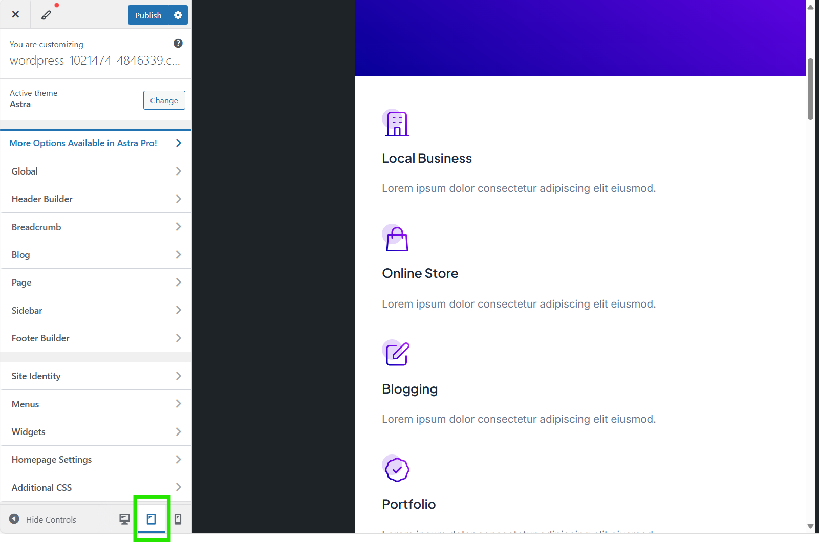
1. Review Your Mobile Version in the Customizer
To get started, you should check what your mobile site looks like. This can be easily done with WordPress Customizer.
To check your mobile preview, login into your WordPress site.
Then access WordPress Customizer by going to Appearance → Customize.
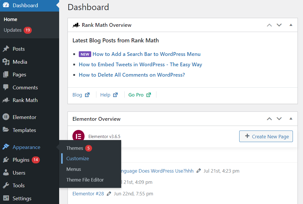
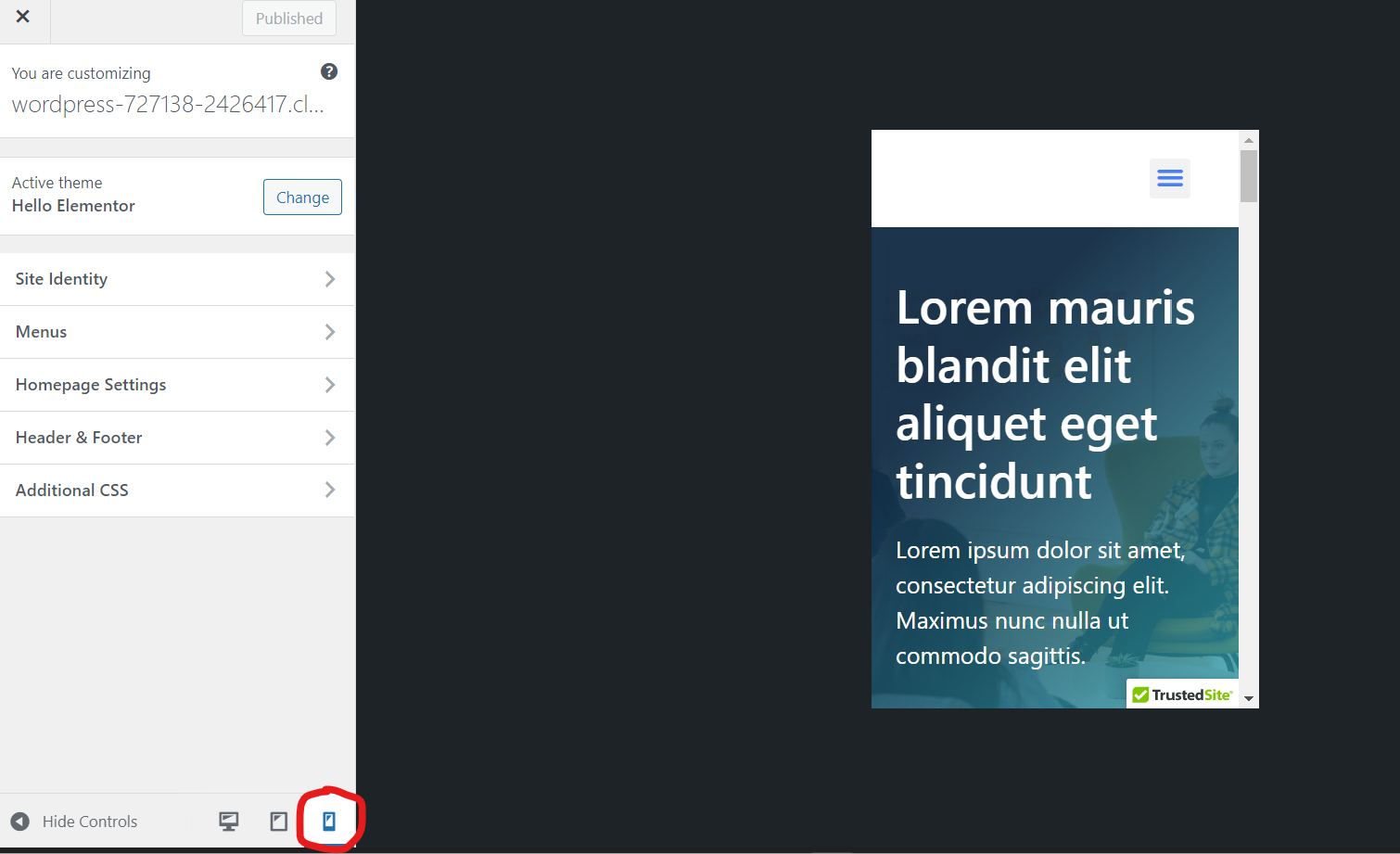
Once you’re in the Customizer, you can click on the mobile icon in the lower right-hand corner of the sidebar.
📝 Note:
The availability of the Customize option depends on your theme.
The option described above is the most common, but you may not have that exact one. If the Customize option isn’t available, check with your theme developer for guidance on customizing your site.
💡 Tip:
Remember that there are lots of different systems, sizes, and browsers for mobile devices, so you’ll never get a 100% accurate mobile preview.
Therefore, I usually double-check the website on actual smartphones and other mobile devices I have access to for greater accuracy.
2. Customize Mobile Version
Next, you can start customizing the mobile version of your site using the Customizer to achieve your desired look.
Depending on your theme you will get a set of customization options like below:
If the options are too limited, you can use the Additional CSS section for further customization. If you prefer not to work with code, consider using a WordPress site builder for code-free customization (we talk more about this in the next section).
In most cases though, the built-in options should be sufficient, especially if you’ve used a well-designed starter template that covers many elements by default.
⚡ Check also ➡️ How to Edit WordPress Site? (For Beginners)
3. Edit Your Mobile Version Using Page Builder
At Siteefy, we use Elementor and Divi when we don’t want to touch code.
Both make it easy to update the mobile version of your WordPress site as much as needed in a code-free manner.
Let’s look at how Elementor helps to edit the mobile version of WordPress websites.
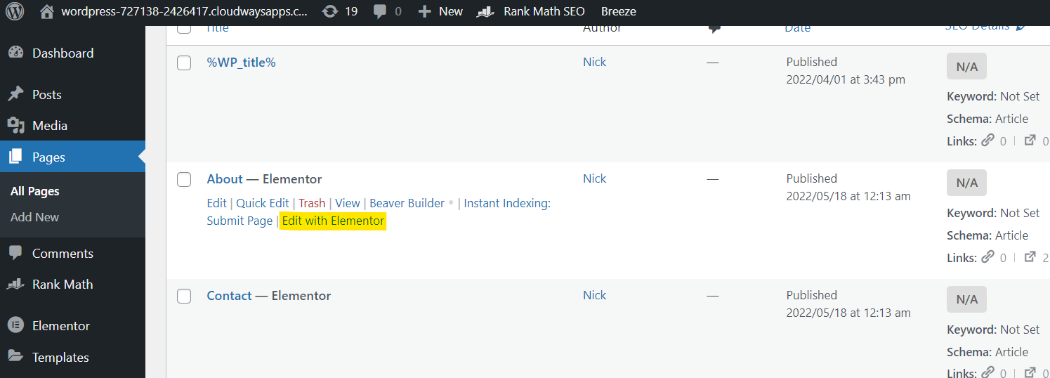
To get started, first add Elementor to WordPress.
Next, activate it.
Once Elementor is activated click on Pages → The page you want to edit → Edit with Elementor. This will take you directly to the Elementor page builder screen.
Once here, click on the mobile icon on the upper bar. Once you do, you’ll get a mobile preview of the page. Now click on the section you want to edit.
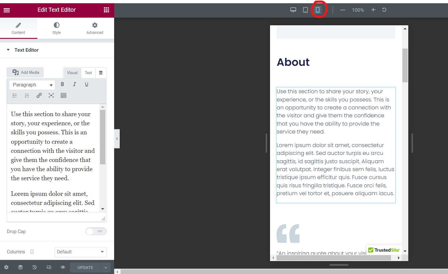
💡 Tip There are lots of features you can edit for your mobile version! Whenever you see a screen icon beside a feature, it indicates that you can specify mobile, tablet, and desktop parameters.
For Updating Text Size
Let’s say your mobile text is appearing too small or large on your mobile version.
To update this, go to Style → Typography → Size.
Click on the screen icon and change it to mobile.
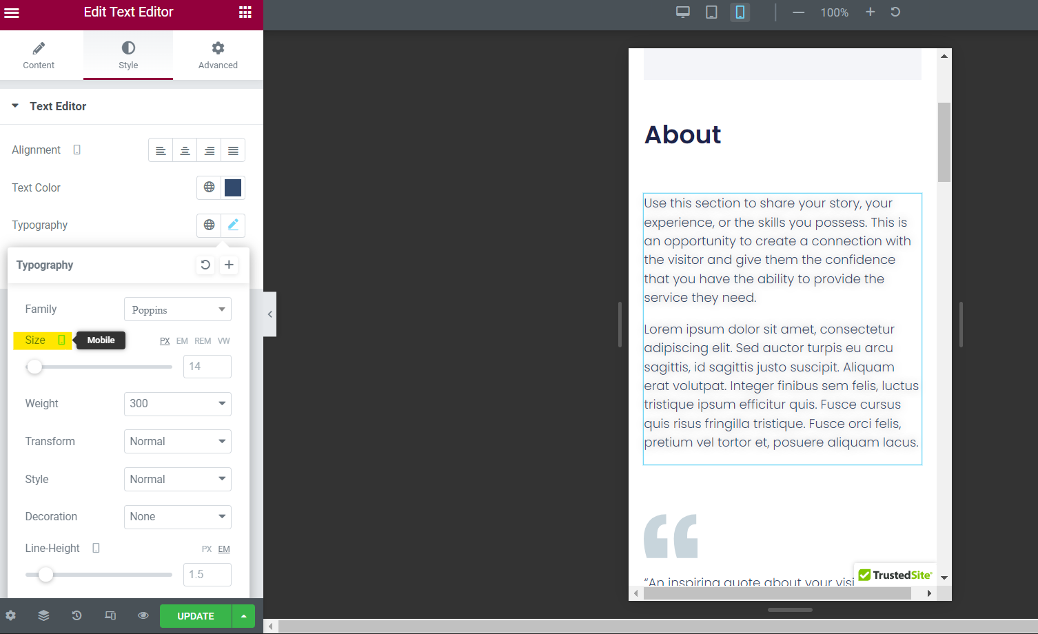
From here, you can update the values in the box for different font sizes on mobile. Easy-peasy!
For Updating Padding
If your mobile text and images run right to the edge of the screen, you may want to add some padding.
This can be done by going to Advanced → Layout → Padding.

Make sure the screen icon is set to mobile and then add the padding numbers for the top, right, bottom, and left as you desire.
Don’t forget that in this same section, you can also adjust margins.
For Updating Image Width/Height
You can easily adjust images so that they fit better on mobile with Elementor.
Simply click on the image element and go to Style → Image → Width or Height.
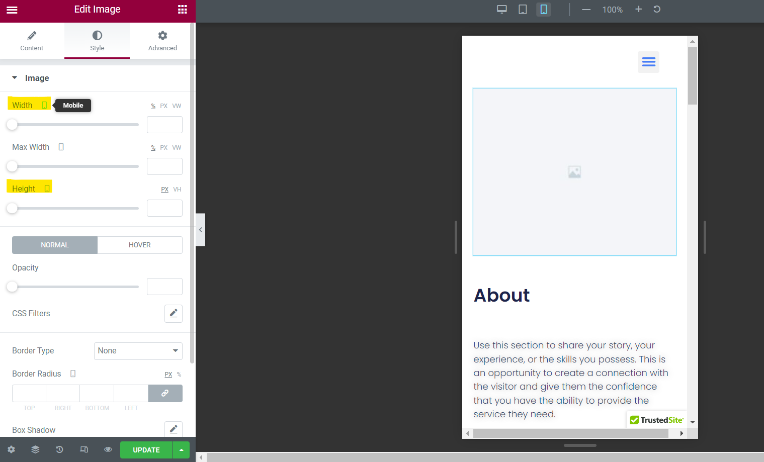
From here, check that the screen icon is set to mobile and add new values to the boxes.
Remember that the mobile preview will show you what this looks like, so keep doing trial-and-error until it looks great.
For Hiding Elements
If you want to hide an element on mobile, no problem!
Head to Advanced → Responsive → Hide on Mobile.
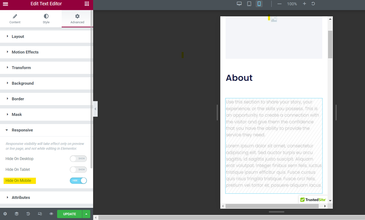
Simply click on the slider button for mobile and your element won’t appear on mobile devices.
For Saving Changes
You can update many other mobile features in the Elementor, including columns, motion effects, attributes, and more.
Go ahead and click around to find even more editable parameters.
Once you’re ready, be sure to save all changes in your page builder by clicking on the Publish button in the upper right-hand corner of your Editor.
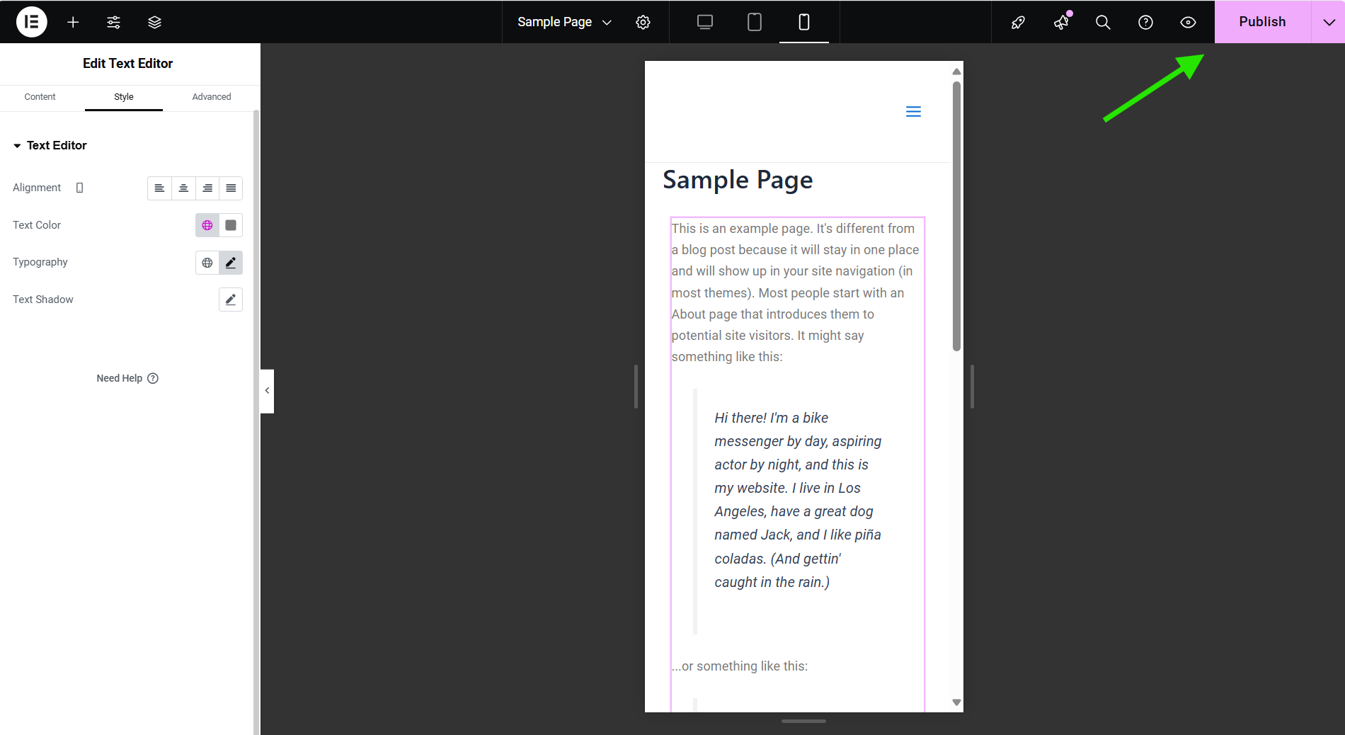
If you don’t, you’ll risk losing the changes you made.
Of course, if you’re not ready for the changes to go live, you can click on the arrow icon right next to the “Publish” button and choose between two other options: Save Draft and Save as Template.
FAQ